Simply PlanArt Direction, Visual Identity, Logo Design
Challenge
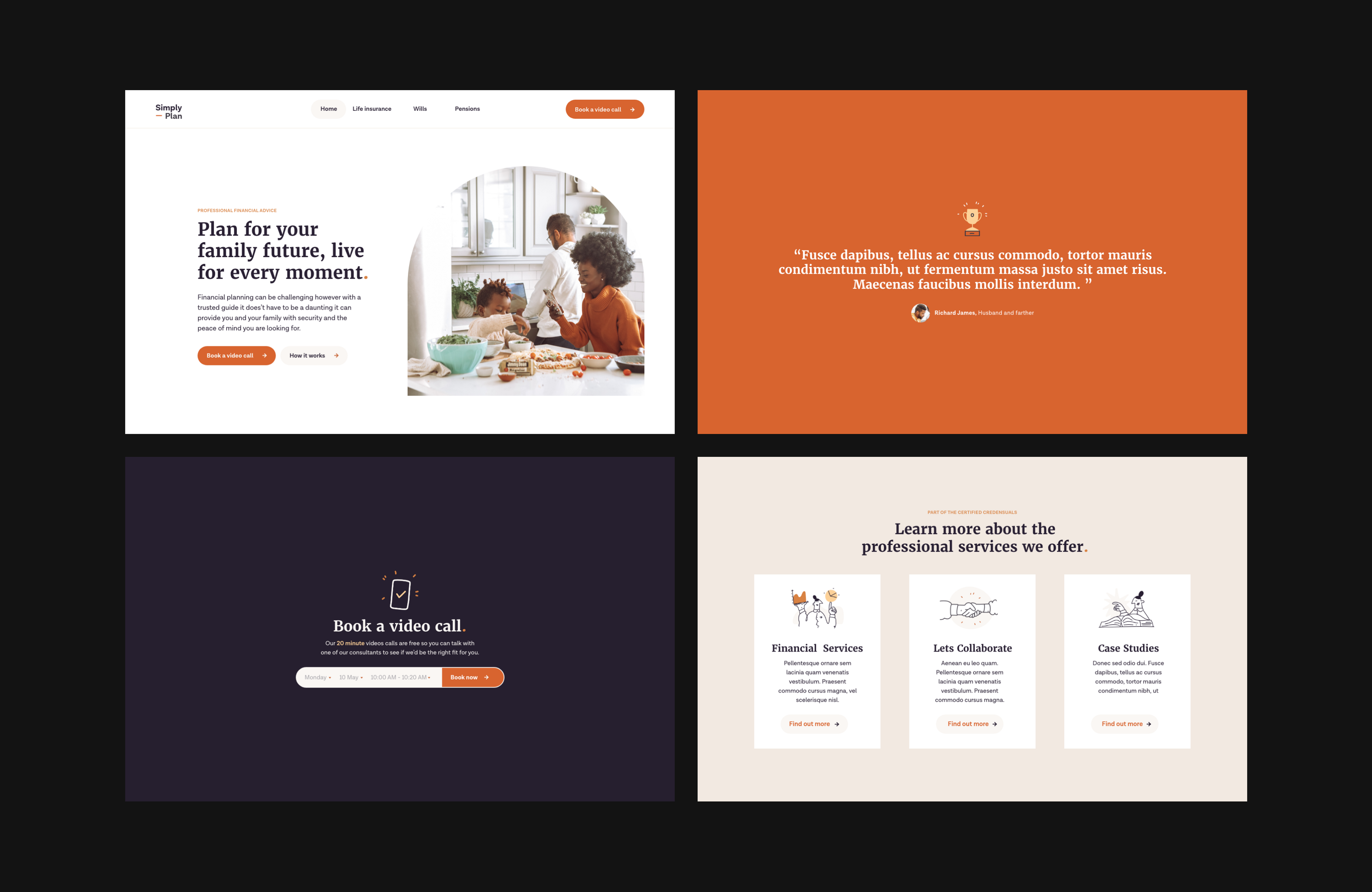
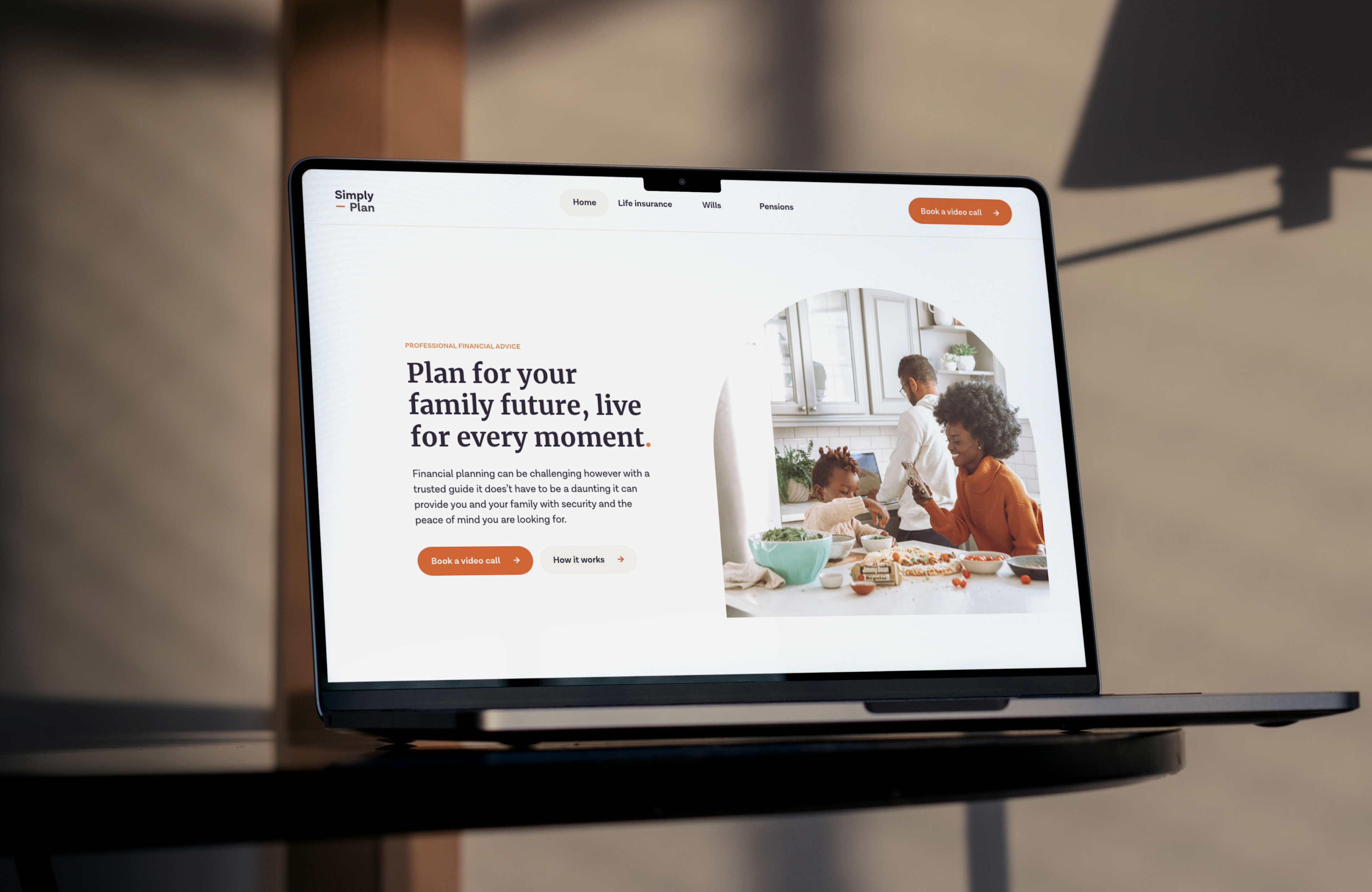
The client ask me to produce an accessible and friendly identity that broke the stereotype of financial advice websites. They had been inspired by the look of modern banking apps, such as Momzon, that have a warm, lifestyle feel. The client’s goal was to make getting financial advice look like an easy conversation rather than something to stress about.
Solution
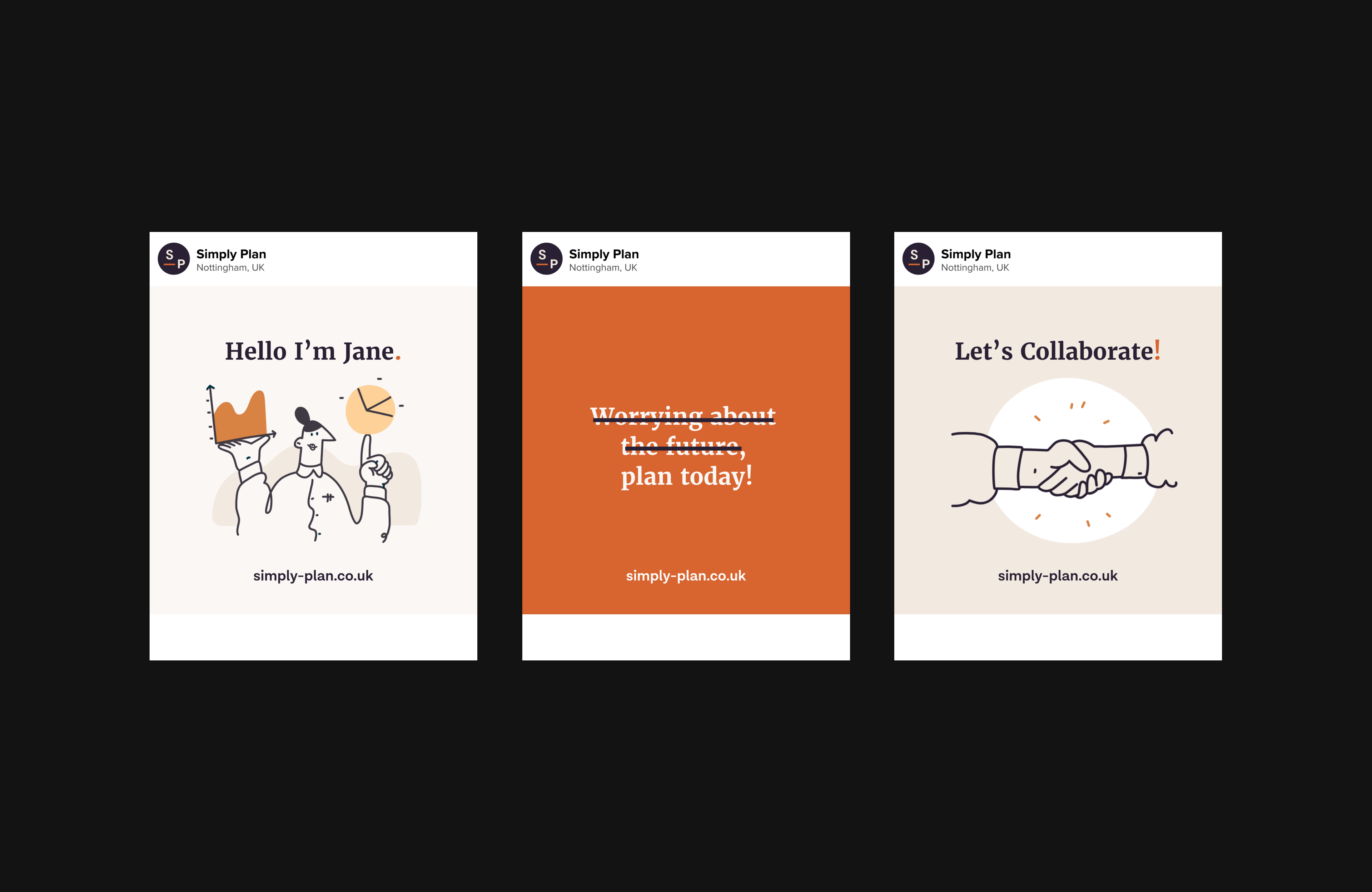
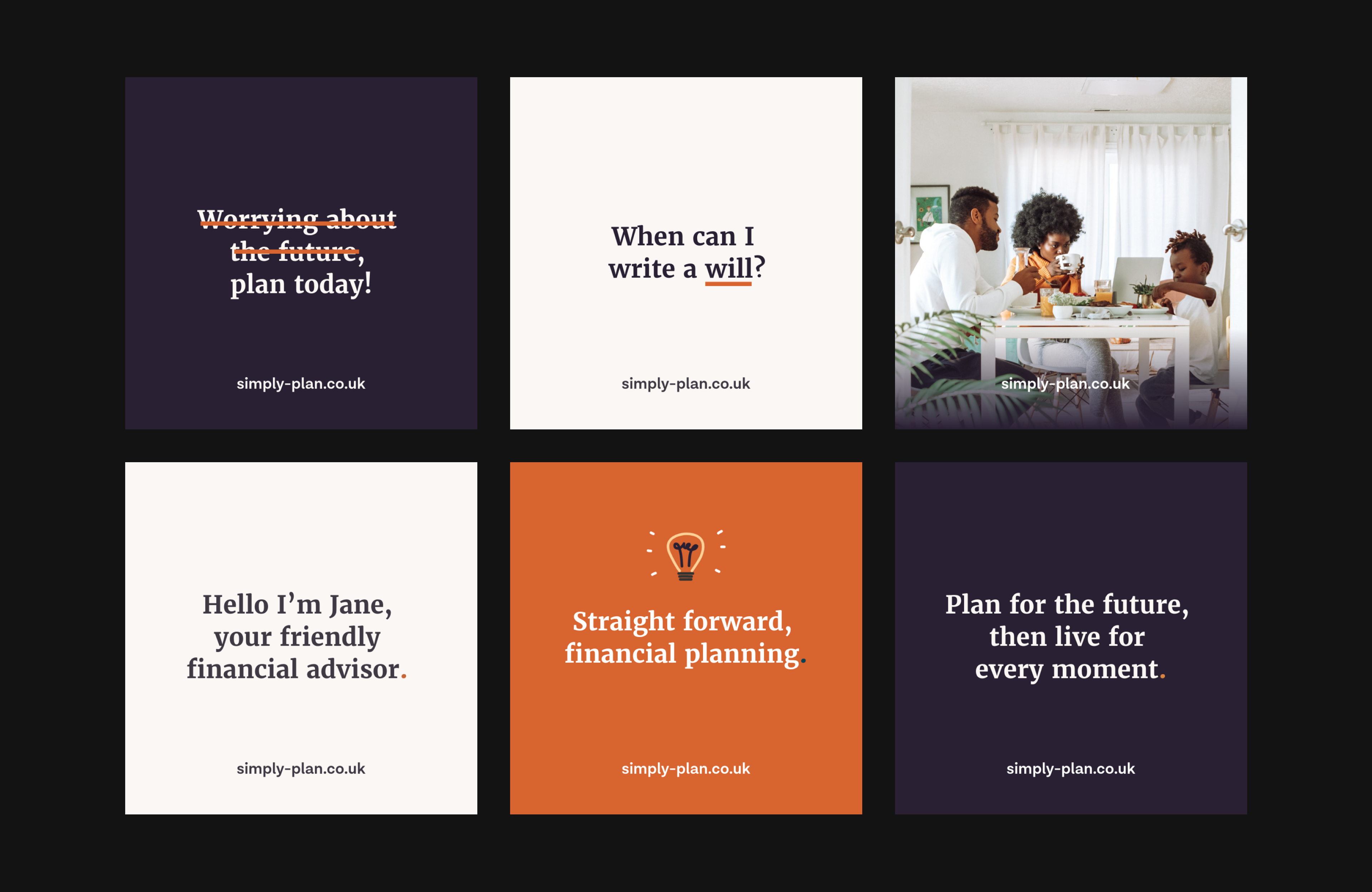
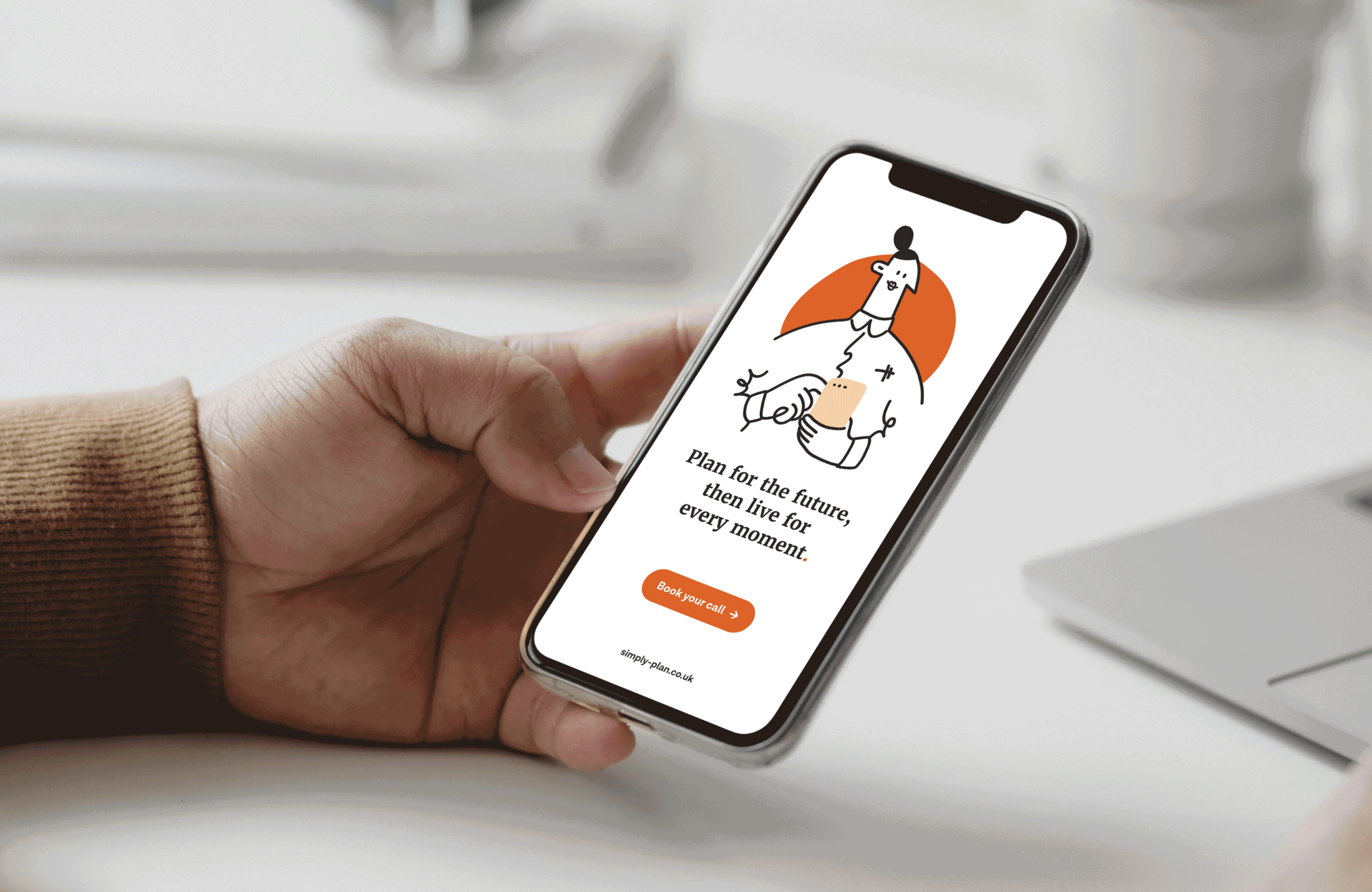
To match the client’s aim of being approachable and straightforward, I created a brand identity with a warm, personal appeal. The audience for Simply Plan is broad, including everyday people from diverse backgrounds. Breaking away from the usual cool blues of financial services brands, I recommended a warm burnt orange. Graphic elements included playful illustrations to keep things light, while photography style had a homely, comfortable lifestyle feel. The word mark is a monogram style that makes use of the hyphen from the brand’s URL.
Services
Art Direction
Visual Identity
Logo Design
Interaction