SindayaArt Direction, Visual Identity, Logo Design

Challenge
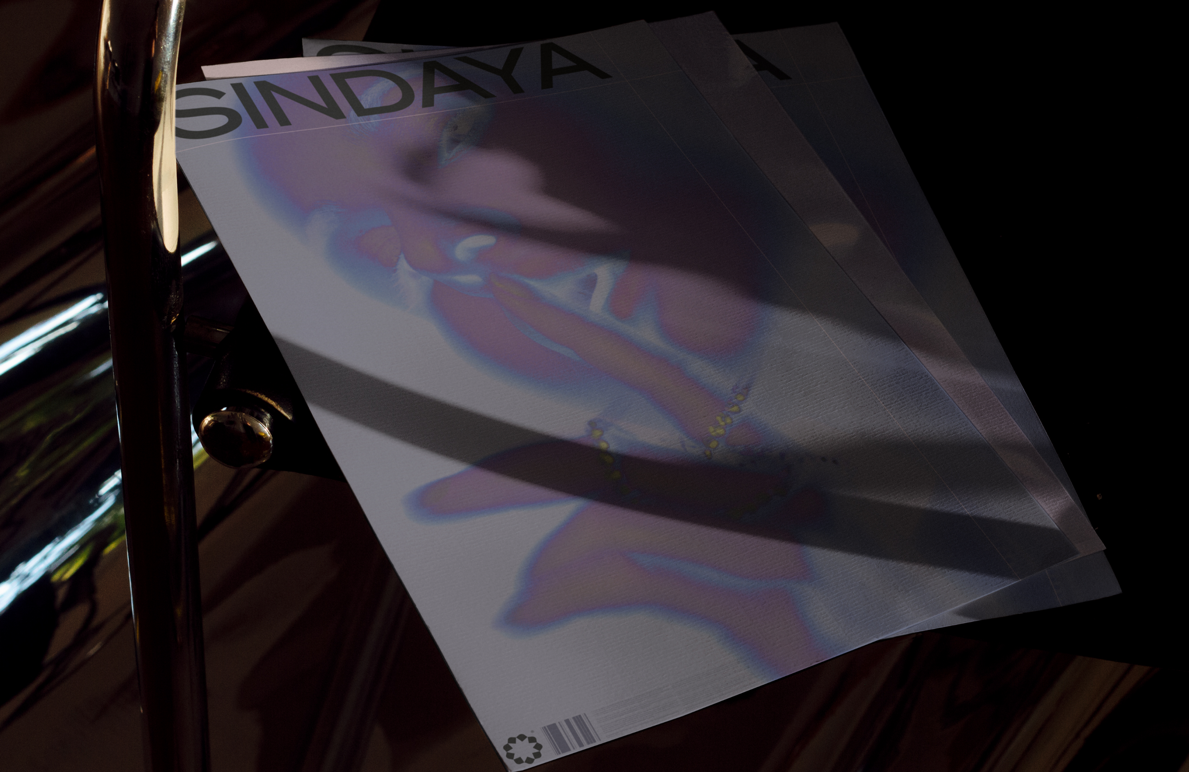
The client commissioned me to produce a bold brand with visual roots in Chinese culture. The jewellery design and engineering would all be produced in China and sold worldwide. It was essential that the brand identity should be modern and have clear standout. Their audience is predominantly female, although there is a male audience too – usually looking for gifts for women.
Solution
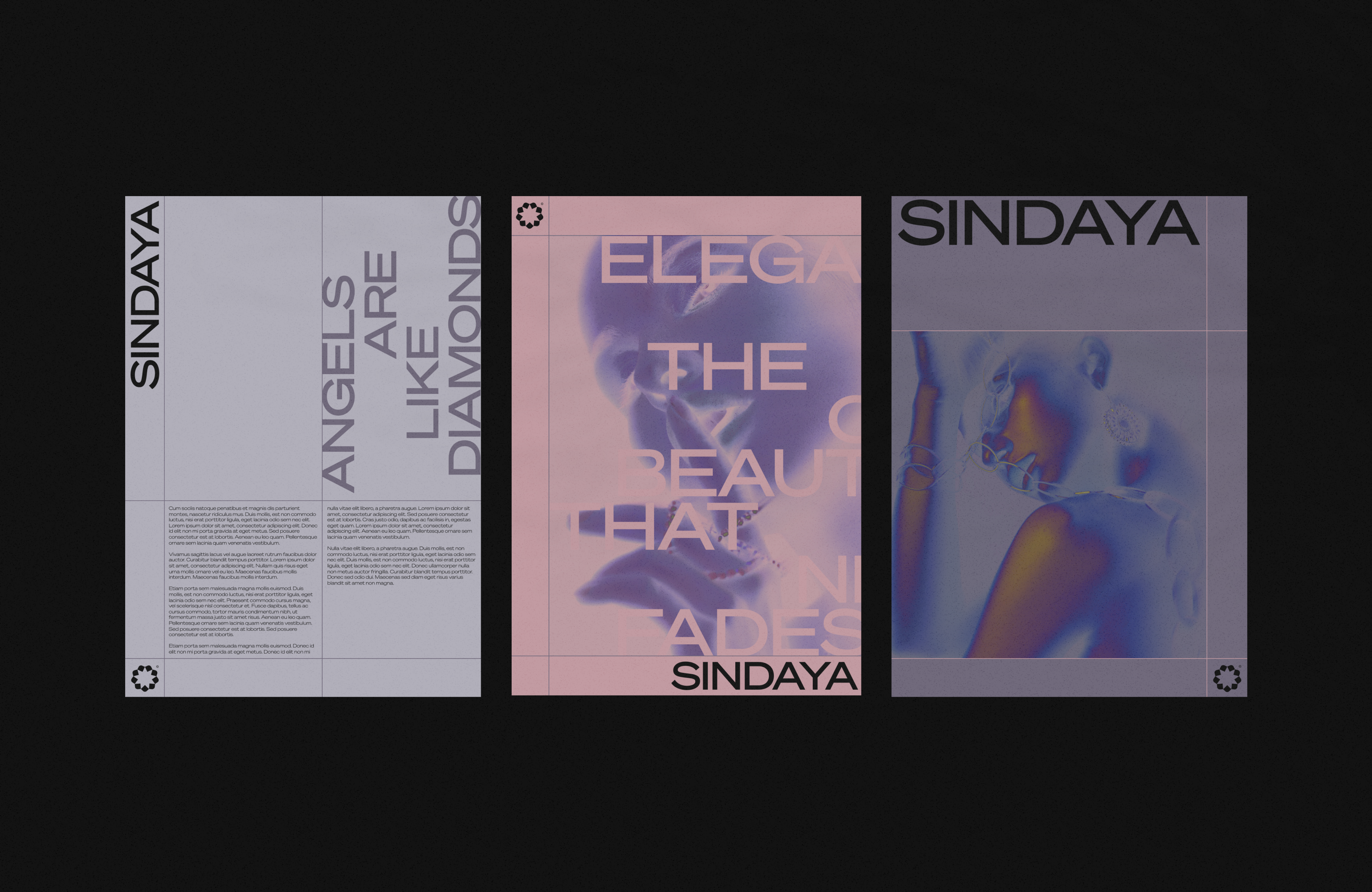
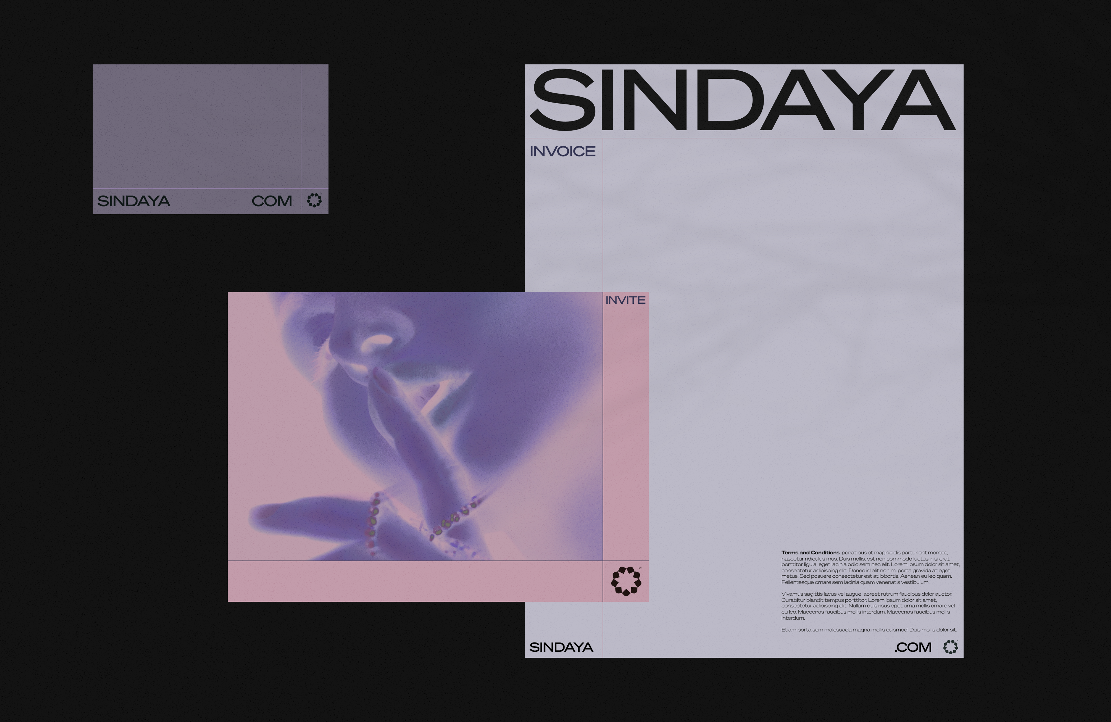
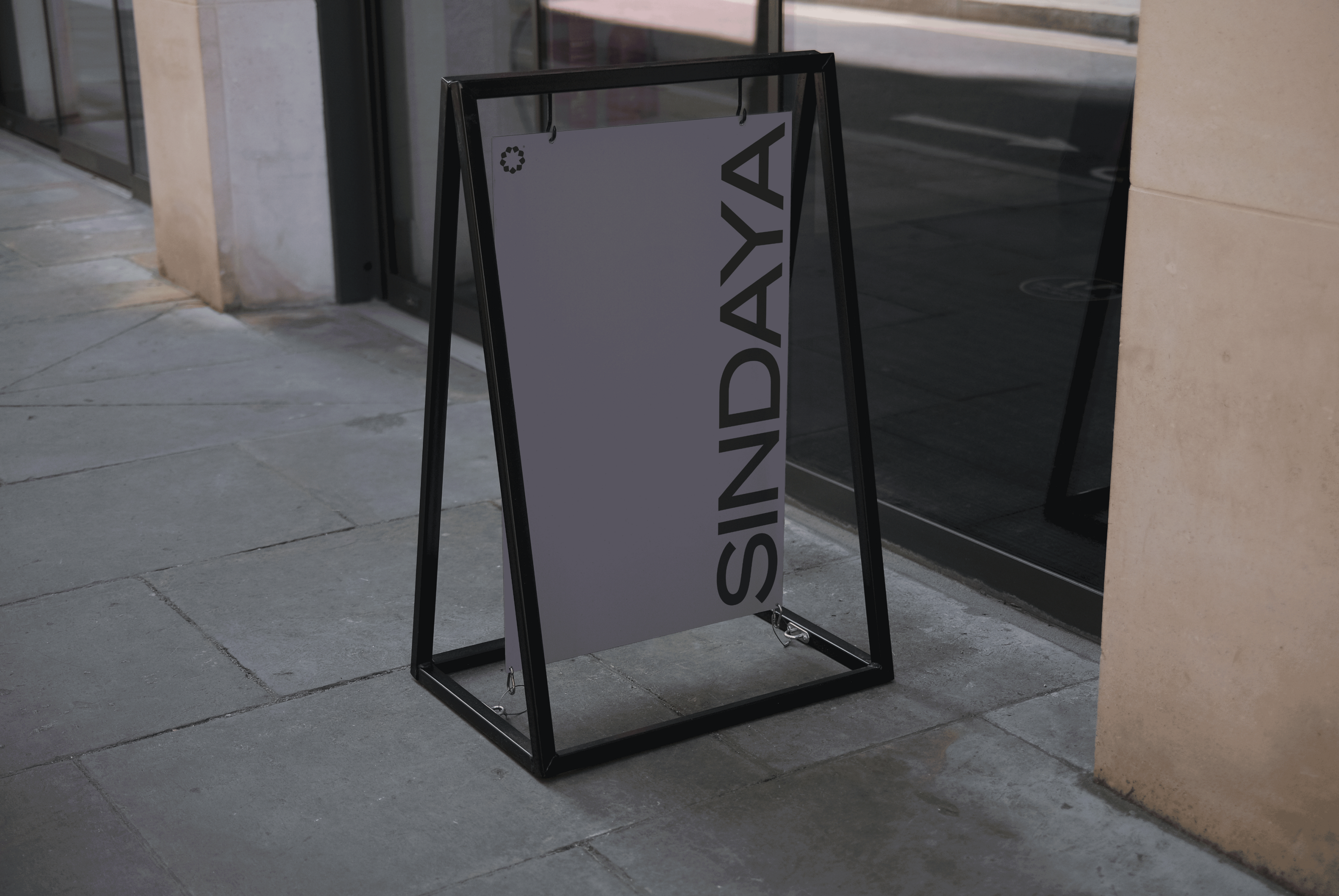
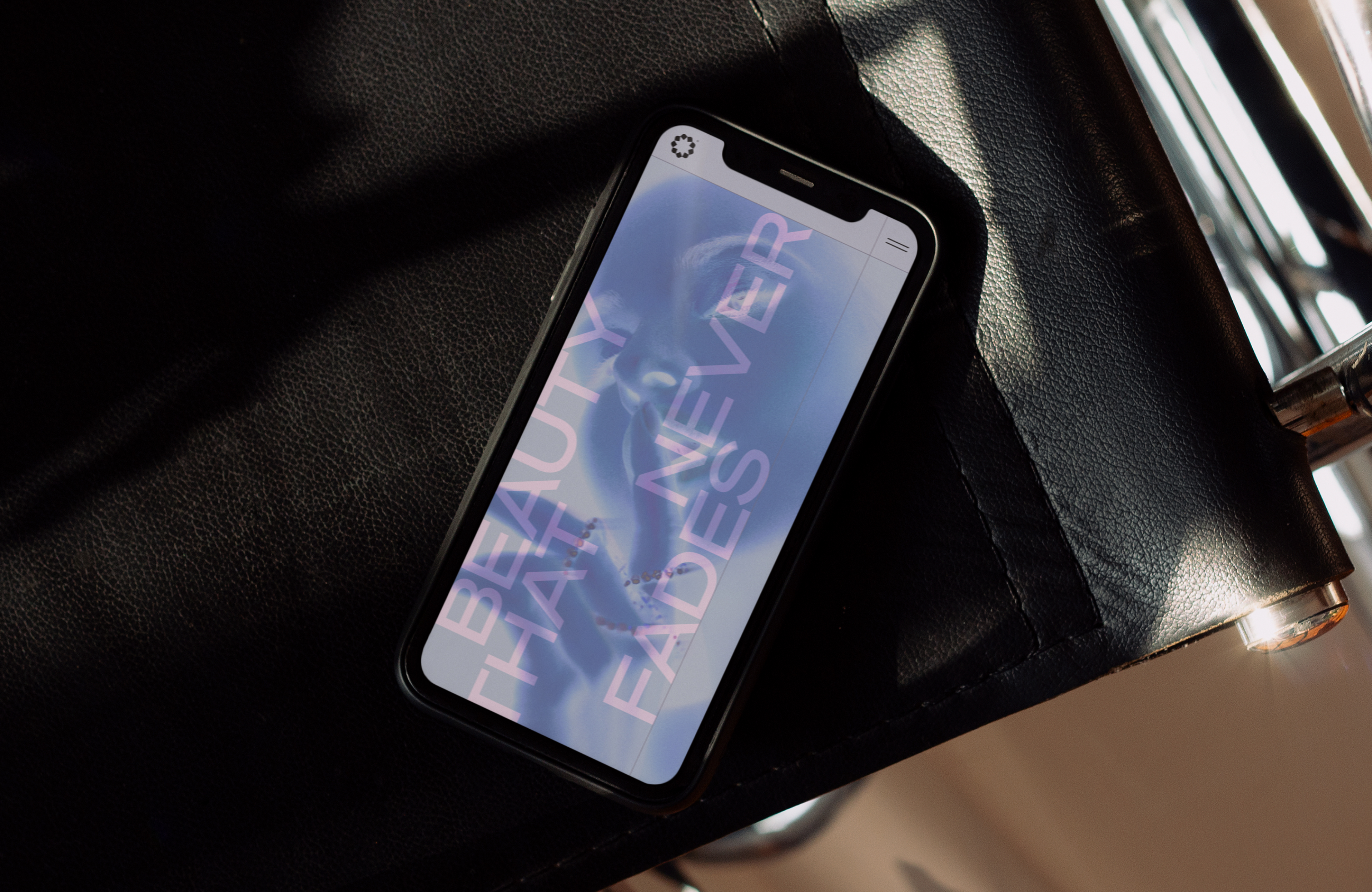
I created a bold yet feminine colour palette inspired by Chinese culture, mythology and archaeology. I designed the logo, or word mark, to be feminine and floral, with a nod to the Chinese flag. The star device I created also represents the beautiful complexity of Sindaya’s signature clasp that can change a bracelet into a necklace. It’s important that all graphic elements support the brand’s USPs, so I crafted an exposed grid system to mirror the robust nature of the jewellery, while keeping the stroke width refined to communicate elegance.
Services
Art Direction
Visual Identity
Logo Design