SoteriorsArt Direction, Visual Identity, Logo Design
Challenge
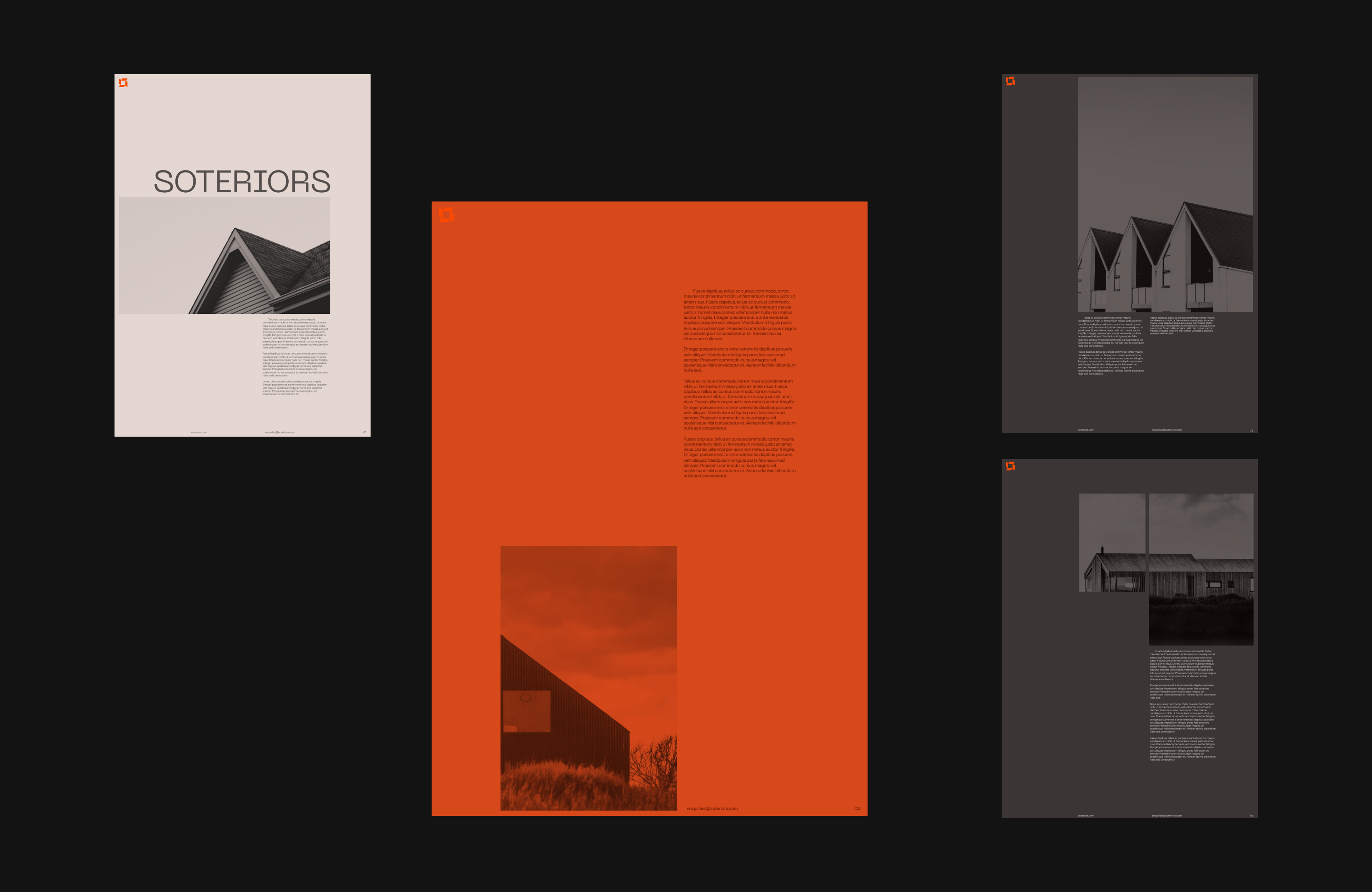
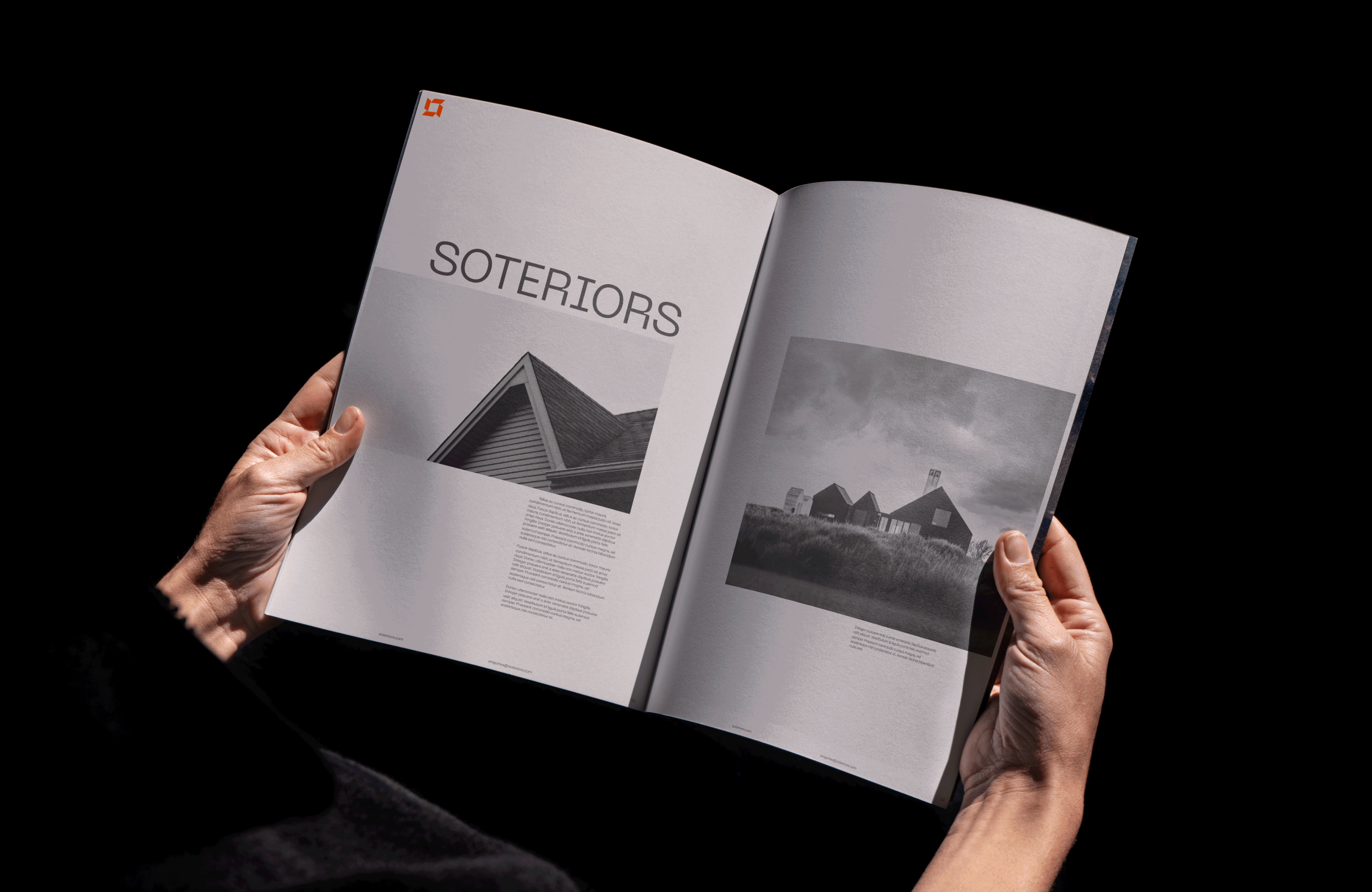
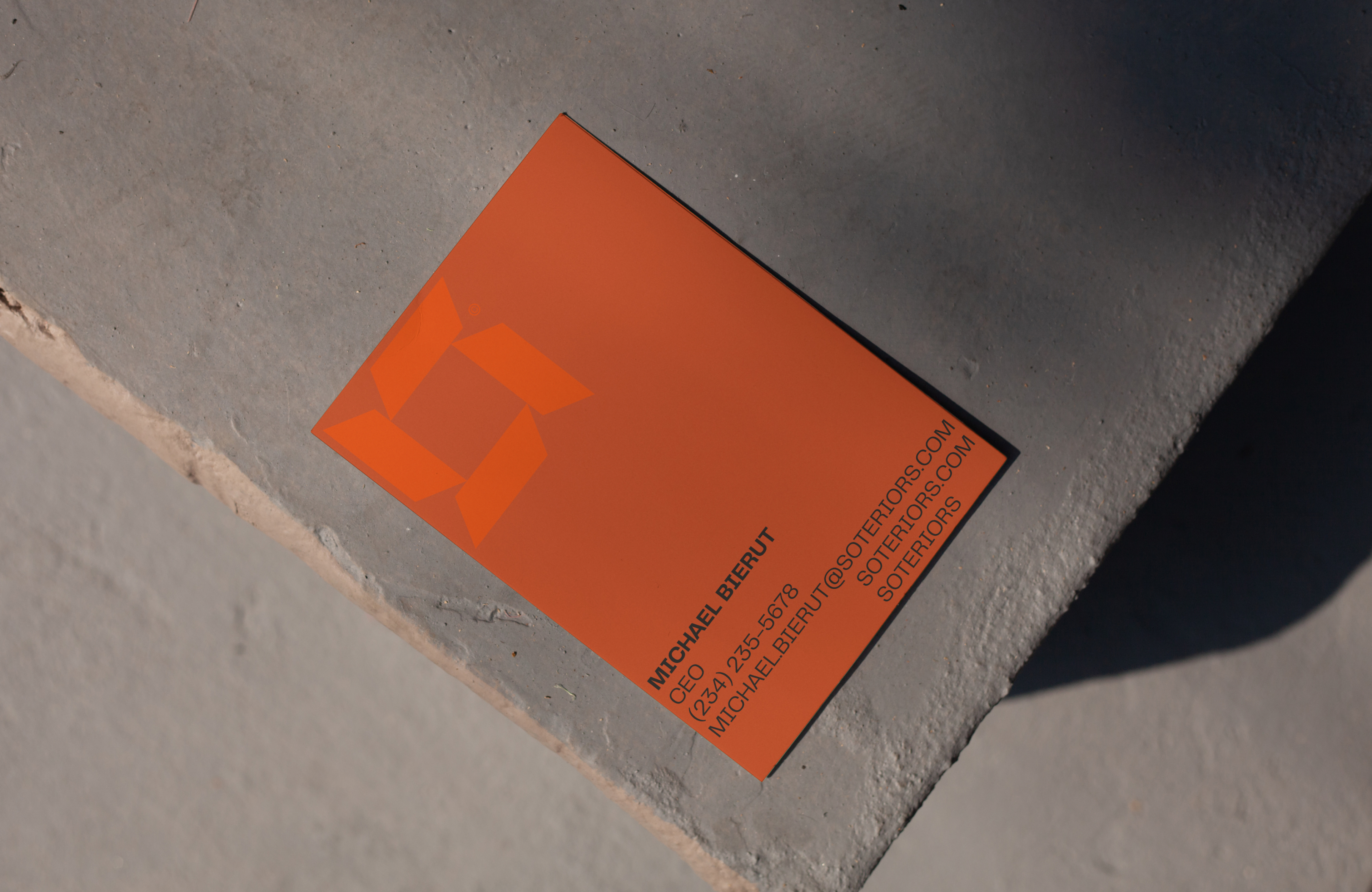
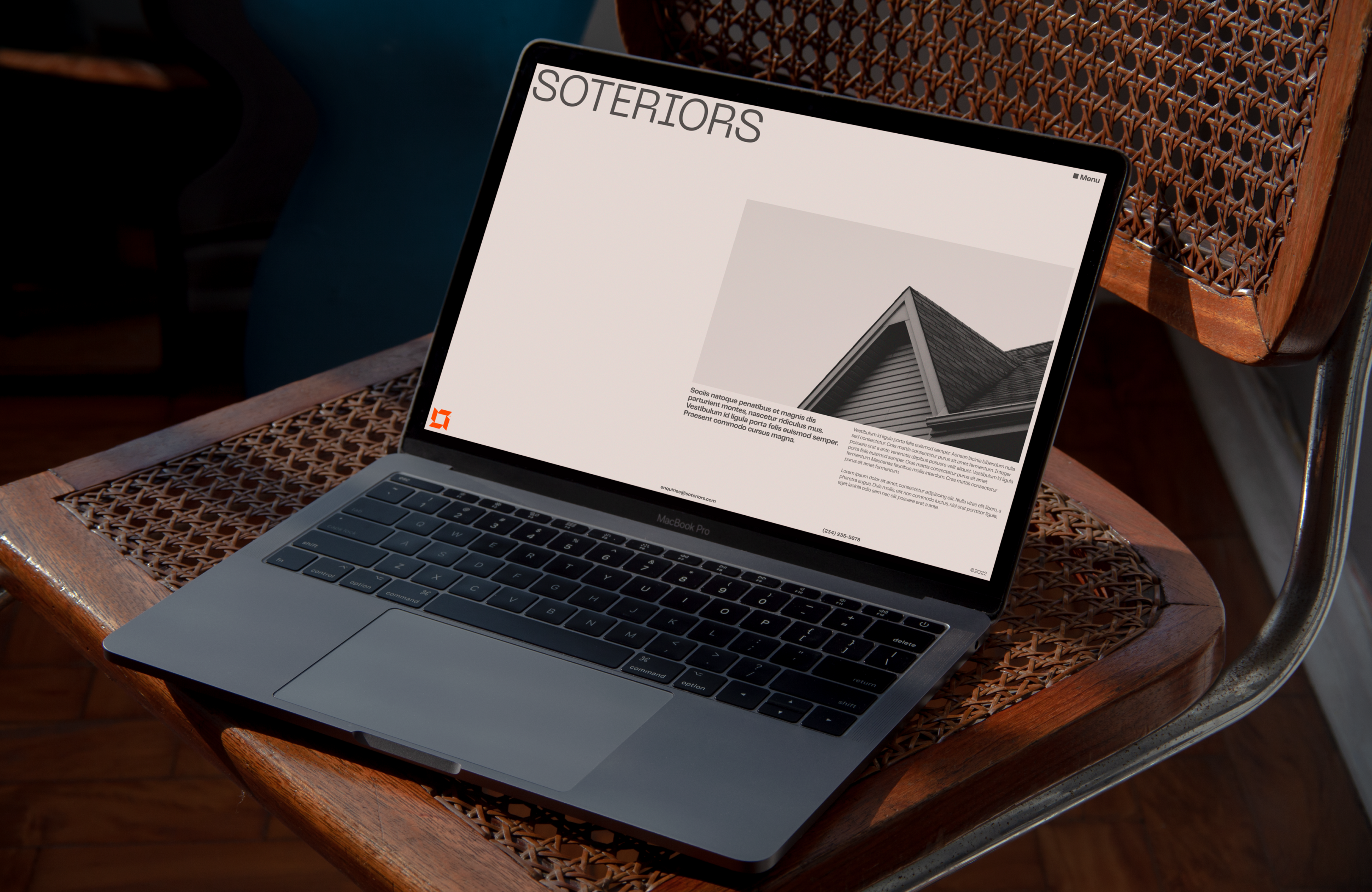
Soteriors is no ordinary roofing brand. This new company’s goal was to work with style-conscious, eco-aware consumers, so their brand had to elevate them above their competitors. They consulted me to create a robust brand that would communicate their offer, while appealing to their audience.
Solution
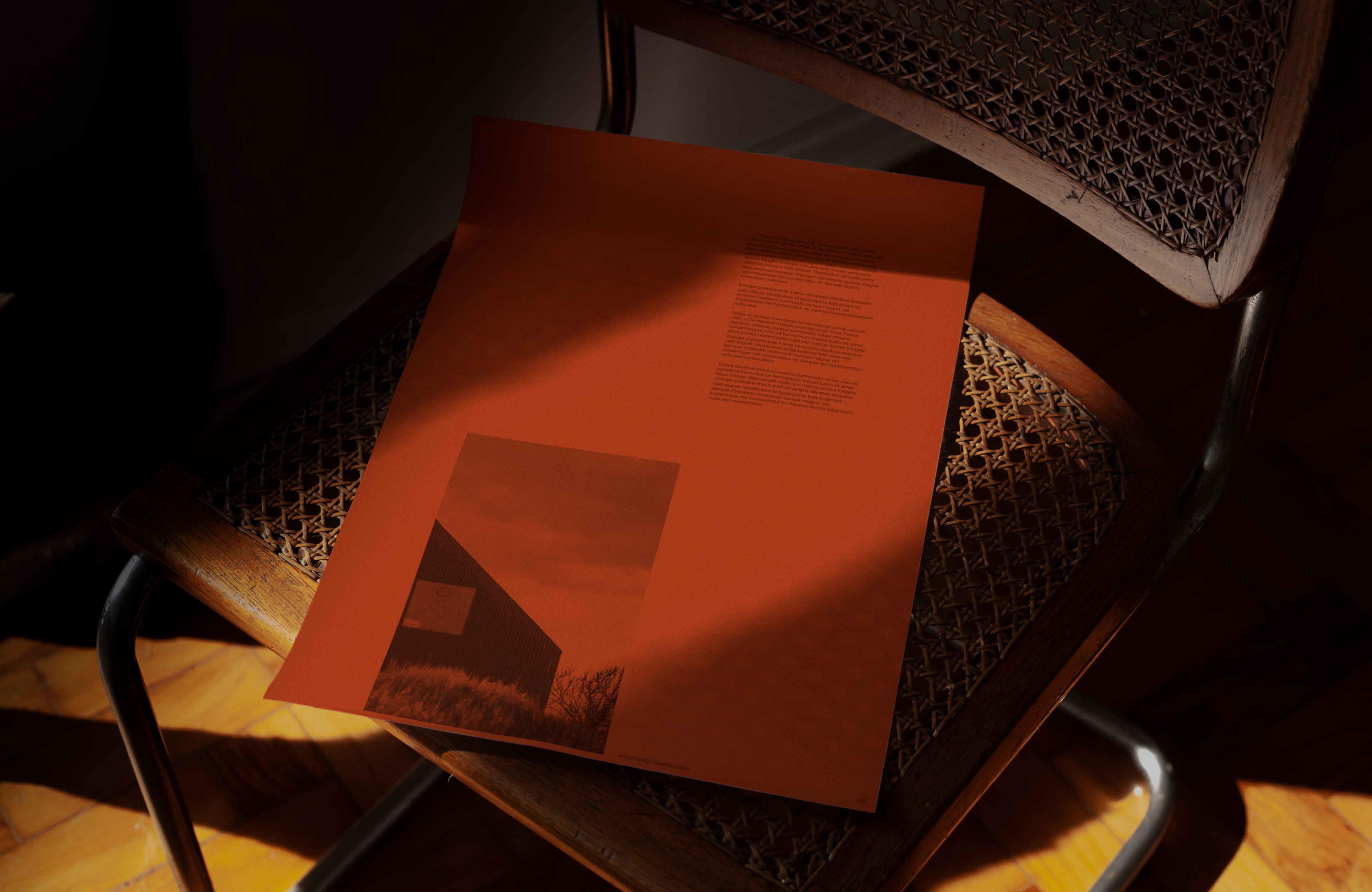
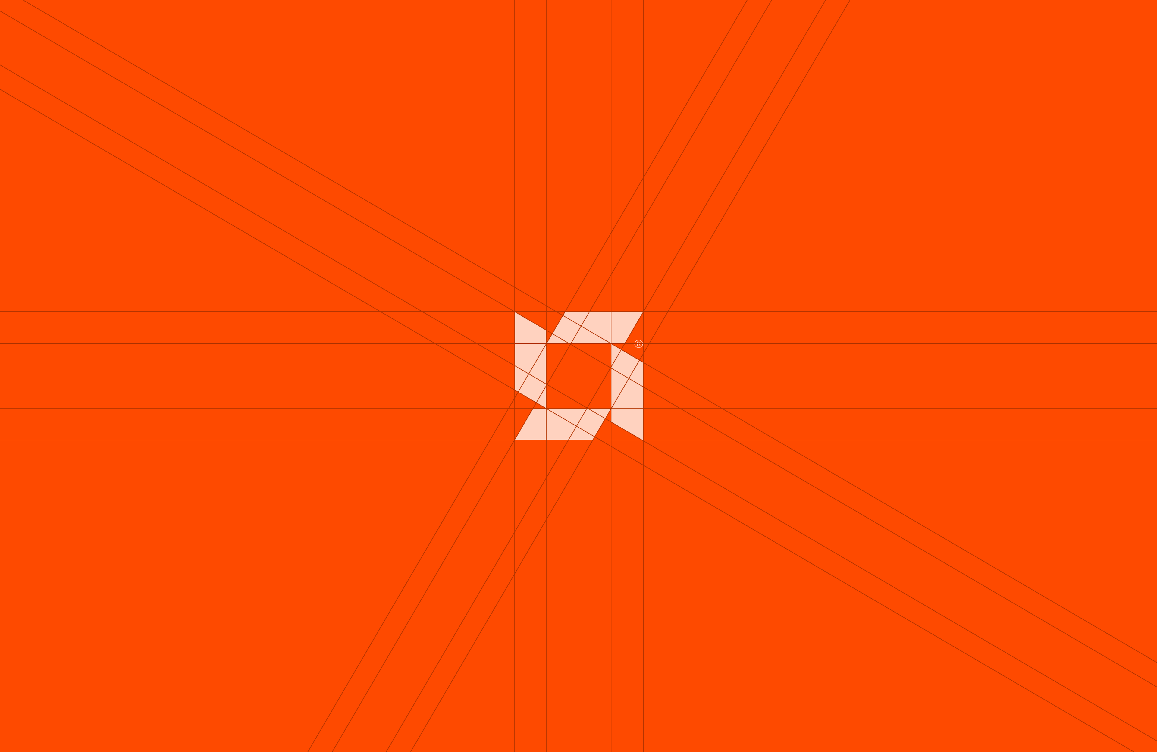
The name Soteriors is a combination of the name of the Greek goddess of safety – Soteria – with the word ‘exteriors’. To support this unique story, I created a logo that features a stylised laurel crown as worn by Greek goddesses. As a graphic device, it is easily recognisable, feels regal and implies a safe, homely space. I devised a colour palette and graphic elements that are simple and bold, to echo the hi-vis colours and hard hats of teams on site. This gives a strong and reliable note to the visuals that works well with their offer.
Services
Art Direction
Visual Identity
Logo Design
Interaction